
I came up with the idea of using more than one large image, to use a selection of images, of that person, 27 images if I want to get smart about it, with the same text over the top.
Building the images;


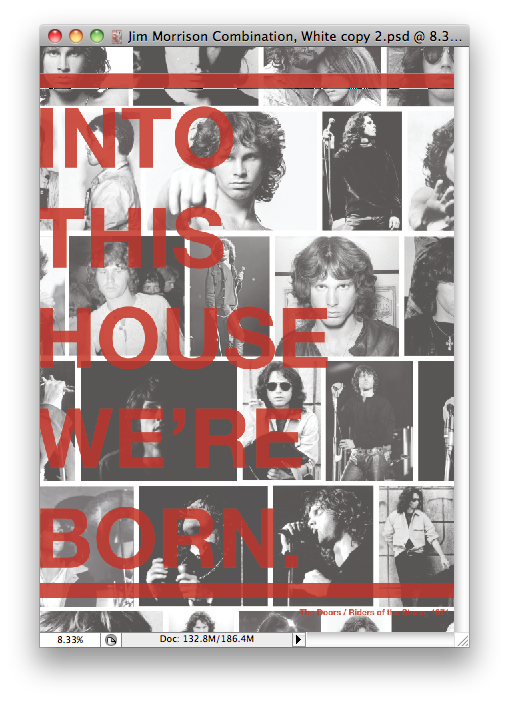
 Started by getting the 27 images I needed, and putting them all into Illustrator, I tried putting them just any where but it wasn't working to well so I tried lining them up, equally gapped and making sure the better picture where around the middle for the audience to see, and then making a cropping mask, and the I can do what I want to do over the top;

 My idea behind these three was to have the same text and boarders as the initial posters and messing with the opacity, here we have the opacity turned to 60% 70% & 80%. Personally I feel the 80% works best for this situation, cause it stands out and you can read the text alot better.
 Like the Kurt Cobain design, I feel this is the strongest design, the one that stands out most to me, not much much, not to less, just the right amount you need on this sort of design.

Reversing the colours white on red, then red on white, I feel the red text on white works really well, but the other way round doesn't work as well, not as strong of a design.

 Cutting out text, once again I don't feel they work aswell, the white back ground with text, is hard to read, the red background isn't as bad, but just don't feel it has the effect that I want these posters to have.
 Messed about with the look of the poster, adding a few lines, to give it a little bit more incase it looks to plain. I really like how it looks, it does stand out, but I don't feel the white and red designs work aswell as the normal background design.
I like how the red works on the dark background of images. Big bright an bold.
No comments:
Post a Comment