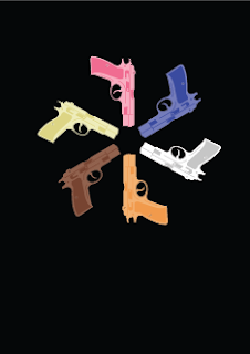
Its never a Quentin Taratino movie unless it involves a gun at some point through out the movie,
So playing on that I decided to mess about with the idea of guns.


My first initial idea was to have the guns overlaying each other, filled in once again with the colour of the characters, each colour representing a character.
Like most of the designs there are just little tweeks and bits of edits so some look very similar.
Sticking to the images being filled in by a colour, I opted for a different positioning,
decided to try the circle, as I did with the ties on a earlier post, and feel they work just aswell,
So at this point it is a hard decision, to have them in a circle or layered.
Tried using abit more detail into the gun, instead of just a fill, and feel they work alot better, a stronger image, alot better on the eye.
The idea of having no fill, and just and outline, trying with both the colours and white,
once again feel the colours are alot stronger, and much easier to know what they represent.
I feel these work well, but just not as good as the filled in images I have also produced.
My reason for liking these is there is no fill at all, so you can see what is underneath each layer, and it gives it a rather cool looking 3D effect, and makes the audience look abit closer to see what is going on.
Same images as before, but like I said just a few tweeks, in this case it is just the circle of guns being rotated a few degree's.
The above images are the set I feel work best, not using any out line but using two tones of each colour, strong images, good on the eye, I also like the two tones, no outlines on the diamond designs to.


I tried the same idea of using two tones but having a 1 stroke black outline,
I feel these still work very well, but just not as good as the ones without.
Overall, I feel the idea of the guns is on par with the ties, but the ties are getting a larger vote from people I have asked, and its the audience that count.


No comments:
Post a Comment